
Designs & email types
Build HTML templates in the designer
The designer produces email-friendly HTML that renders reliably in the major clients (Gmail, Outlook, Apple Mail). The in-plugin preview helps, but it does not replace a real test mail in real inboxes.
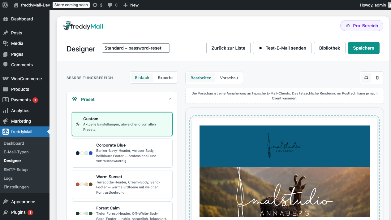
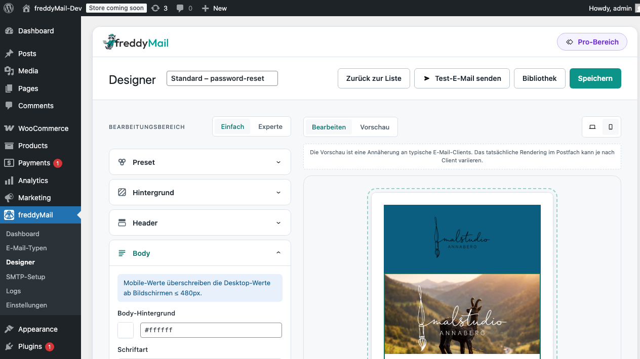
The designer’s five sections
- Pick a preset. A starting point for width, spacing and base typography. Saves fiddly work later.
- Set the background. Outer surface color and inner spacing. Usually the only thing that changes when rebranding.
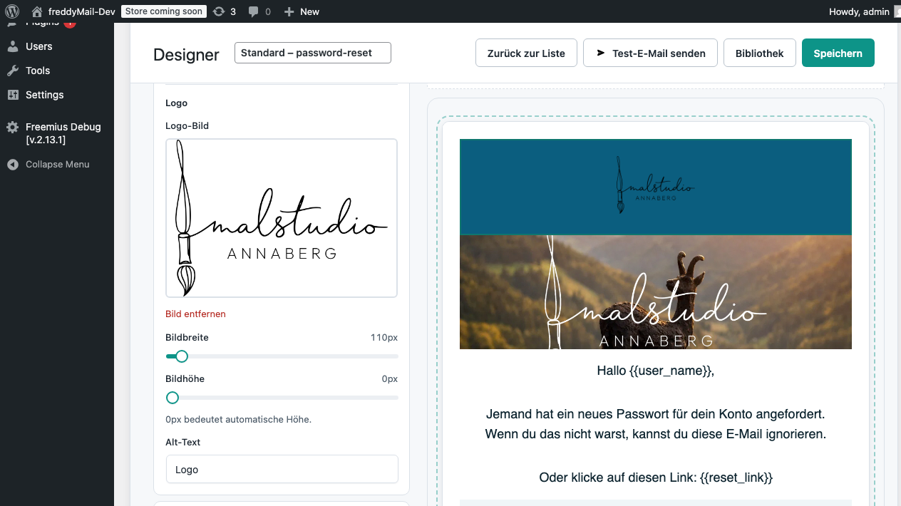
- Customise the header. Logo (HTTPS only!), title, alignment and mobile behaviour.
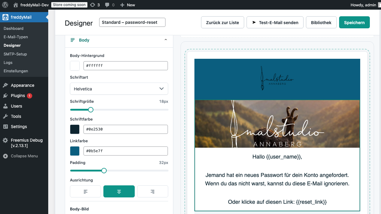
- Configure the body. Type sizes, text color, link color, button style, paragraph spacing.
- Check the preview. Desktop and mobile widths. Only then save and send test mails.
Preset picker
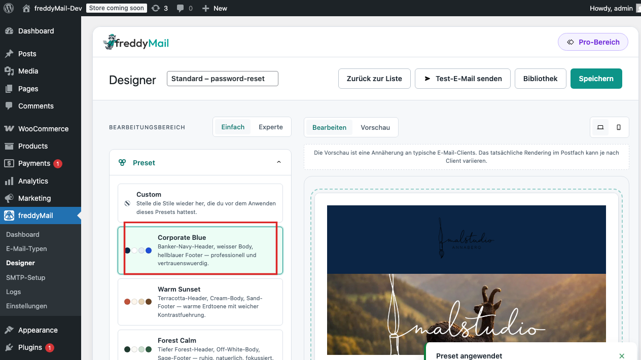 Annotated
 Header editor
Body editor
Preview
Library
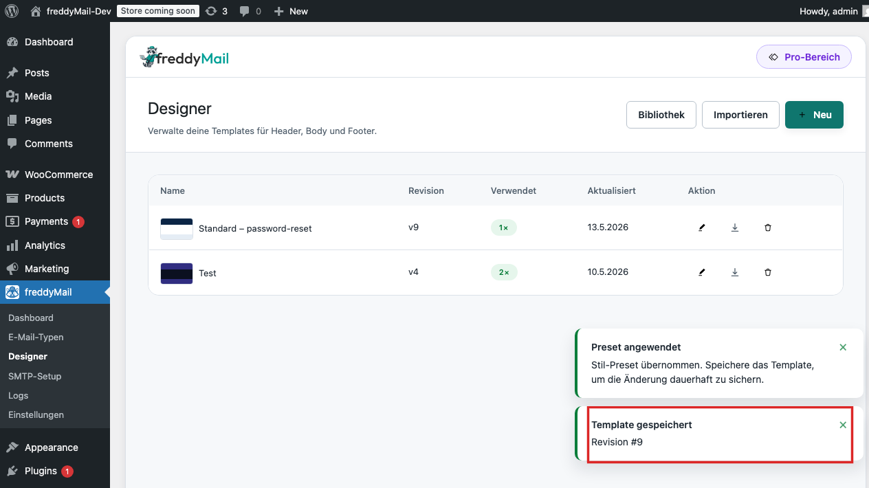 Annotated
 Pre-publish design check
- Logo loads via HTTPS and is not too large (max 200 px wide).
- Text is readable in dark mode.
- Buttons have enough contrast and work as links.
- The mobile width has been checked.
- Test emails have been opened in the most important clients.